
 Sara Dickerman on Gourmet
James Beard–award-winning writer Sara Dickerman has a good piece in Slate on the history of food styling and the austerity of the recent covers of Gourmet magazine. She’s right—they are nearly colorless and sometimes a bit scary.
It’s funny, though, that as she was thinking month after month how depressing and bland the covers were, I was thinking how much I liked them, and how they were gorgeous and classy despite their scariness. She says covers should “entice and provoke”; I was enticed and provoked. I don’t even like Gourmet much, but I appreciate any magazine that is confident enough to keep it simple.
I have never been able to stand crowded magazine covers on which the words are all different colors and sizes and often cover up the model or the magazine’s title, issue number, and date. Just show me a beautiful picture, and let me wonder about what’s inside. Does anyone read all that junk on the cover of most magazines and feel enticed? Wordy, colorful covers are out.
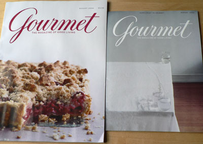
The August issue is a perfect illustration of Gourmet’s somber mood, although I must say that the cover of the supplement is really not making me hungry.
Comments
i feel the same way, all of us at work did actually. We were all commenting on that the shot of the chocolate cake was gorgeous. the past few covers certainly made me want to flip through the publication more.
I like the newer covers, too. Much more intriguing, and just better-looking all around.
Add a comment