 Desperate SUV-sellers plumb depths of advertising stupidity
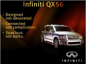
Gosh, we thought the Lincoln Navigator’s prissy dream of taking on Mother Nature was as weirdly stupid as SUV ads could get. Not so. Infiniti (the best transsexual stripper name ever) fires back with this ad that ran on boingboing, probably the worst market possible for such a beast:
The Infiniti QZPXRW4398349834 and its Nissan “Frontera” sibling are the clumsiest attempt to look big in the history of American-marketed automobiles (a tough competition). This ad, which I clicked through to confirm was no joke, can only be the result of the following brainstorming session in marketing:
Boss: Ok, guys, let’s list the worst qualities of the QZPXRW4398349834.
Debora: Our focus groups say it looks like we just tacked on a bunch of decorations to make it look fancier than the Frontera, adding, you know, [making air quotes] “bling” I think they call it.
Boss: Interesting.
Tony: Yeah, I have that in my MySpace research too. Actually, here’s a quote: “It looks like they couldn’t decide what to do with the 25 feet of sheet metal so they just put in a bunch of complicated creases.”
Boss: “Complicated.” MySpace. Interesting.
Jonathan: Yeah, it’s a behemoth whose bulk serves no purpose but to impress, yet the transparency of that motive undermines it entirely. People are pointing and laughing at these things, and their puny drivers.
Boss: Ok, Jon—you’re fired. Everyone else, here’s what we’re going to do: deny the obvious. Got it? We list the opposite of these things. You know, like on a slide in PowerPoint, a list of things, um—
Jonathan: You’re looking for “bullet points,” I think.
Boss: That’s it. You’re still fired. So, basically, we tell people in three or four [air quotes, sideways glare] “bullet points” that what they see with their own eyes is wrong. Oh, and we’ll make the product image small, at a weird angle, and poorly lit.
I want a mock-up on my desk by Friday.


Add a comment